Consider this the first of more than a handful on unveiling parties. As we move closer to Golden Tee 2016, we’ll continue to dive deeper into images and videos of what we have in store. (Course logos and videos are next, by the way. You should probably write that down.)
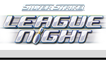
What we have here, however, is the unveiling of our Golden Tee 2016 marquee. It’s on the game, it’s above the game and you’ll be seeing this everywhere over the next few months and well beyond. It is, in many ways, our mascot for everything boxed in that cabinet.
Also, and this is my unbiased opinion, it looks fabulous.
It’s also much more than just a flashy way to advertise our game as NEW. It takes a great deal of thought, planning and creativity to find the image that best suits a given year. And, because deep down we’re all supreme Golden Tee nerds who want any morsel of 2016-related news, let’s dive into this process some.
Senior artist Sean McMenemy, who also created last year’s marquee, was the mastermind behind this year’s version.
From start to finish—from brainstorming to finished product—creating the Golden Tee 2016 marquee took a few weeks. It went through dozens of drafts. Research and brainstorming took a day, and then the process of finding the right image began in the form of sketches.
Some of McMenemy’s many ideas are featured below. (There were more, we just couldn’t fit them on here.)
“I wanted to create something that was a little more sports-specific than past years,” McMenemy said on his inspiration. “We wanted something a little more defined and concrete; something that was maybe a little sharper. I looked at this as a rebrand of sorts, albeit a familiar one.”
The shape of the design came first. You’ll notice that LIVE is nowhere to be found on the image above, which is new and purposeful. It also allowed McMenemy to use bigger text and have some more wiggle room with the logo.
Next came the color, which again took some thought and experimenting. Because Showpiece cabinets will now have illuminated marquees available—a new addition to 2016—finding the right color for the logo was even more important than ever before.
“The white text is a direct product of having a light behind the image,” McMenemy said. “The same can be said about the lighter, brighter colors in the back. The darker colors do a nice job of framing the logo, while the yellow for 2016 should really help highlight the given year.”
The end result is a gorgeous symbol for the next installment of Golden Tee—a sharper, sleeker look that symbolizes some of the exciting new things to come.
This is just the beginning. We have much, much more. Stay tuned to Goldentee.com to see the fantastic new course logos in the coming days, PLUS… drumroll… the course trailers are just right around the corner.